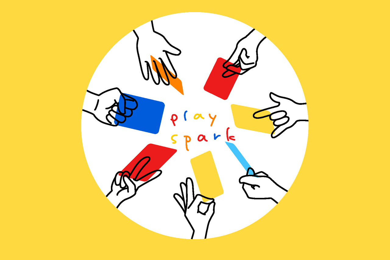
Hopes Brand (Board Games) Feature
We don't design games; we design a way of being.
It doesn't clamor. In the rustle of turning pages, it accompanies you through an afternoon that needs respite;
It doesn't provide answers. As you gaze at that blurred blue-gray hue, it allows you to be less strong for a while.
Hopes is a presence you can put down anytime and pick up again.
Because true companionship never requires you to hold on tight all the time.

- Published:
- 2026
- Tasks:
- Design Strategy, Brand Design, Packaging Design, Display Design, Interaction Design, etc.
- Design Team:
- RIDS
Hopes Brand (Board Games) Feature
Brand Design | Strategy, Visual, Product, Packaging, Space, etc.
Core Philosophy:
Companionship is not interaction, but "being there." Non-judgmental, non-intrusive, providing a quiet emotional container.
Brand Positioning:
Daily, silent, growing — adapting to fragmented time, carrying different moods.
Visual Language:
Colors: Warm gray, off-white, twilight blue (low saturation, ample negative space)
Graphics: Blurred outlines, negative space metaphors, rejecting realism and sharpness
Typography: Handwritten-style regular script / imitation Song, loose layout with a sense of breath
Product Design:
Packaging: Quality, concise, generous
Product: Interesting, warm, simple
Content: Text-driven (quotes/questions/short poems), open to interpretation
Brand Communication:
Photography: Natural light, everyday corners, products coexisting equally with life objects
Copywriting: First-person, gentle narration ("Perhaps it's possible," "Some also see it this way")
Digital Restraint:
Online presence only for inquiries and story sharing; core experience remains in tactile, offline interaction
—— RIDS