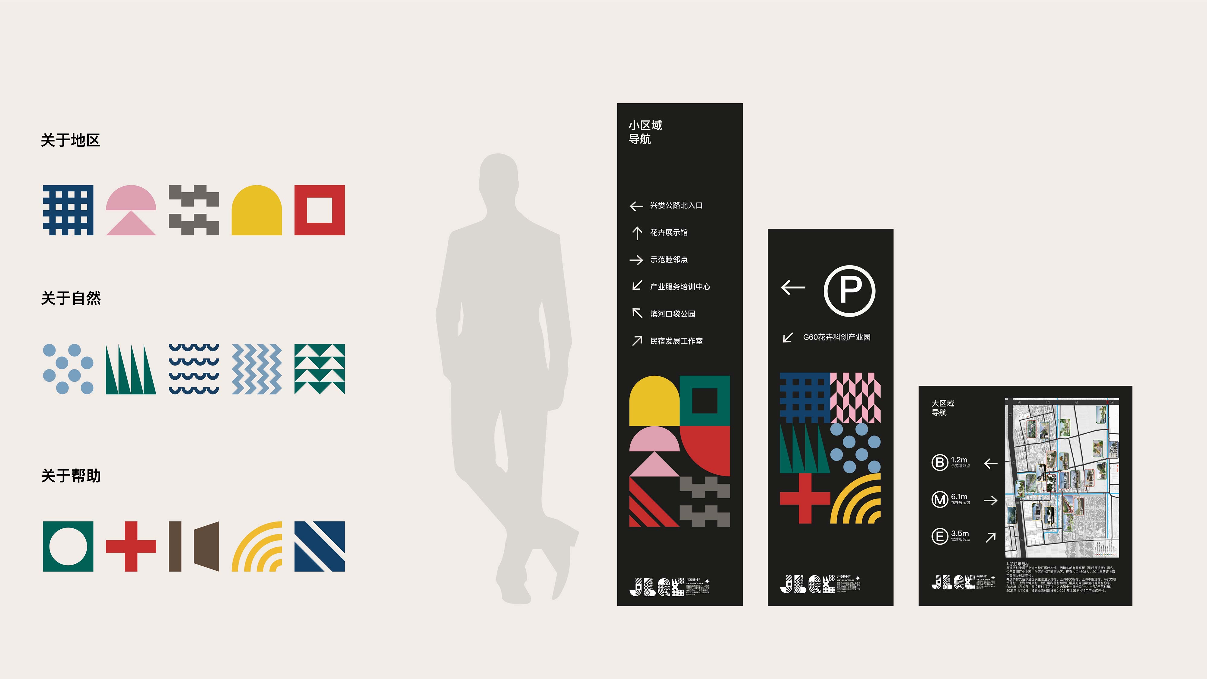
We integrated the village's architectural forms, industrial structure, and future values into its signage design.
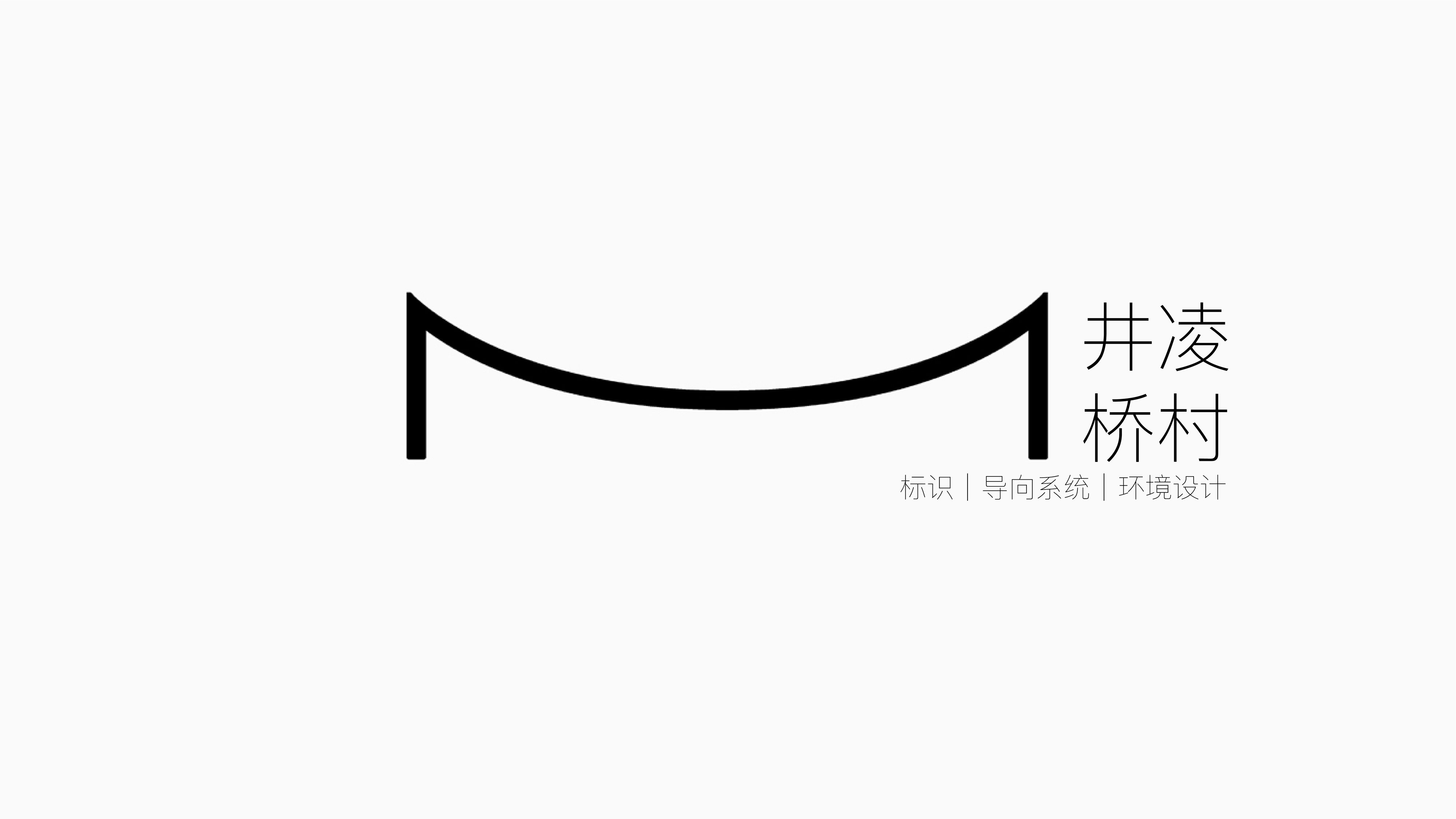
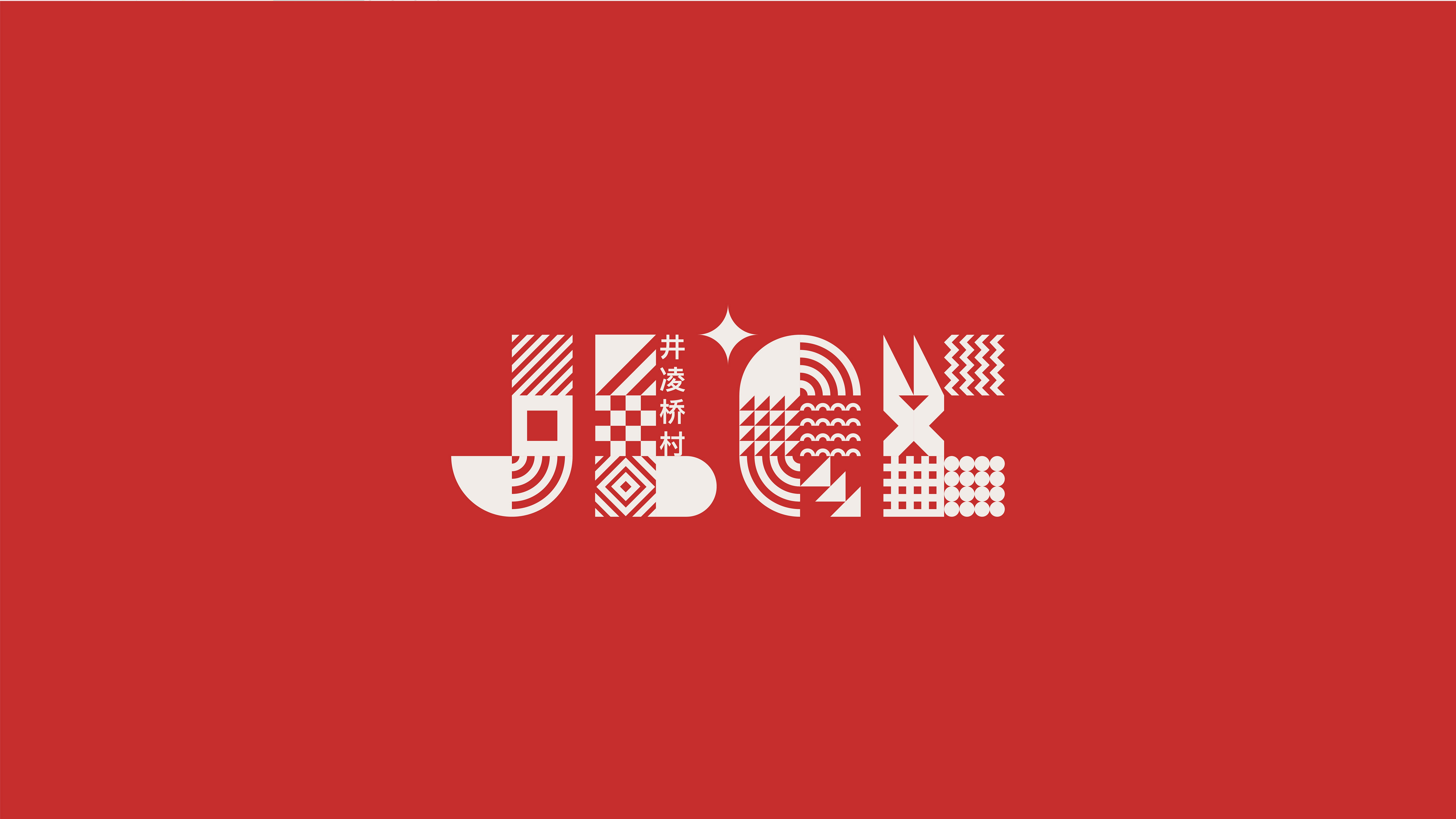
Shanghai Jinglingqiao Village Wayfinding System
Type | Brand Promotion
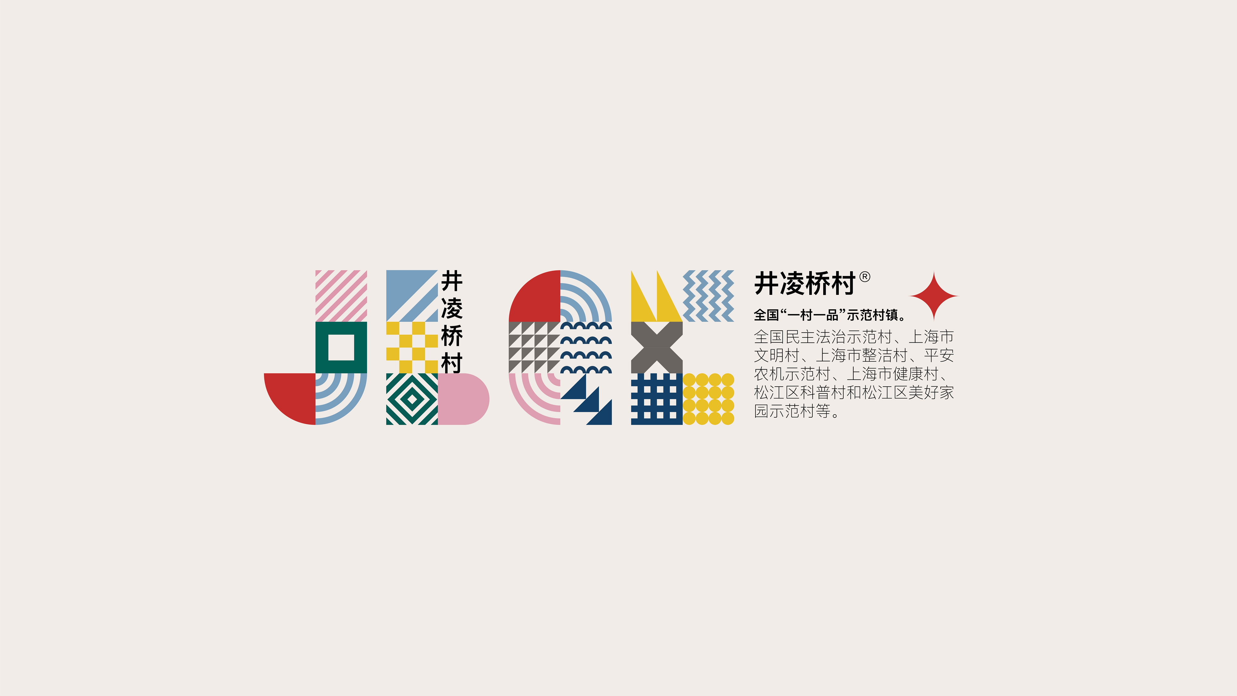
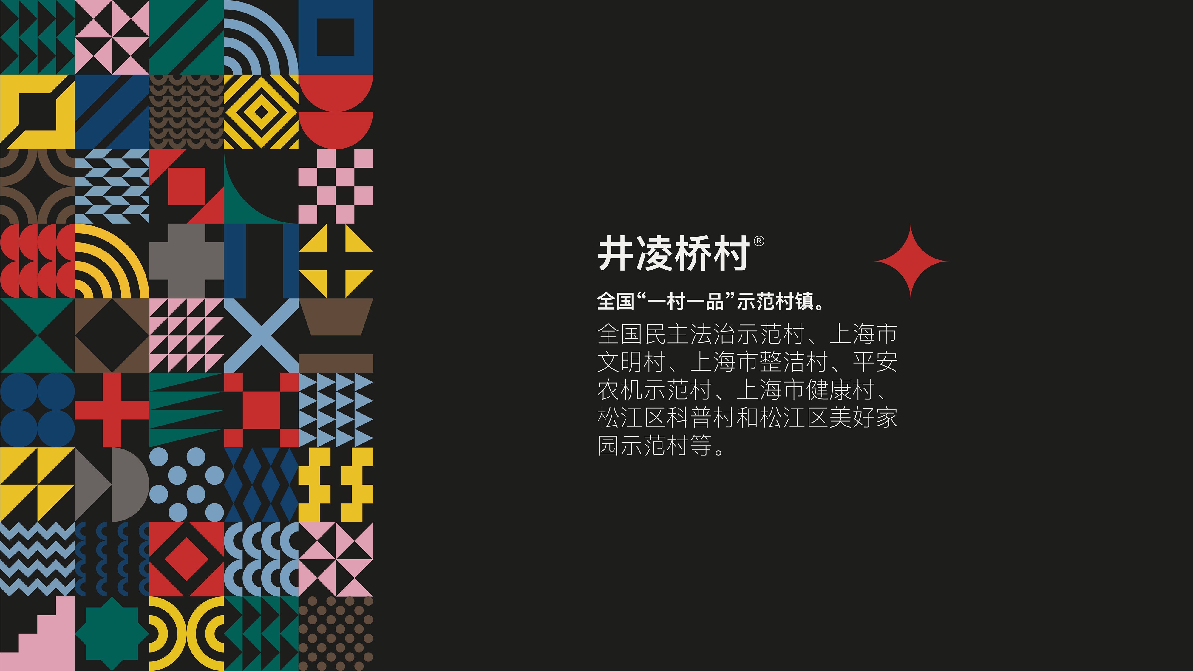
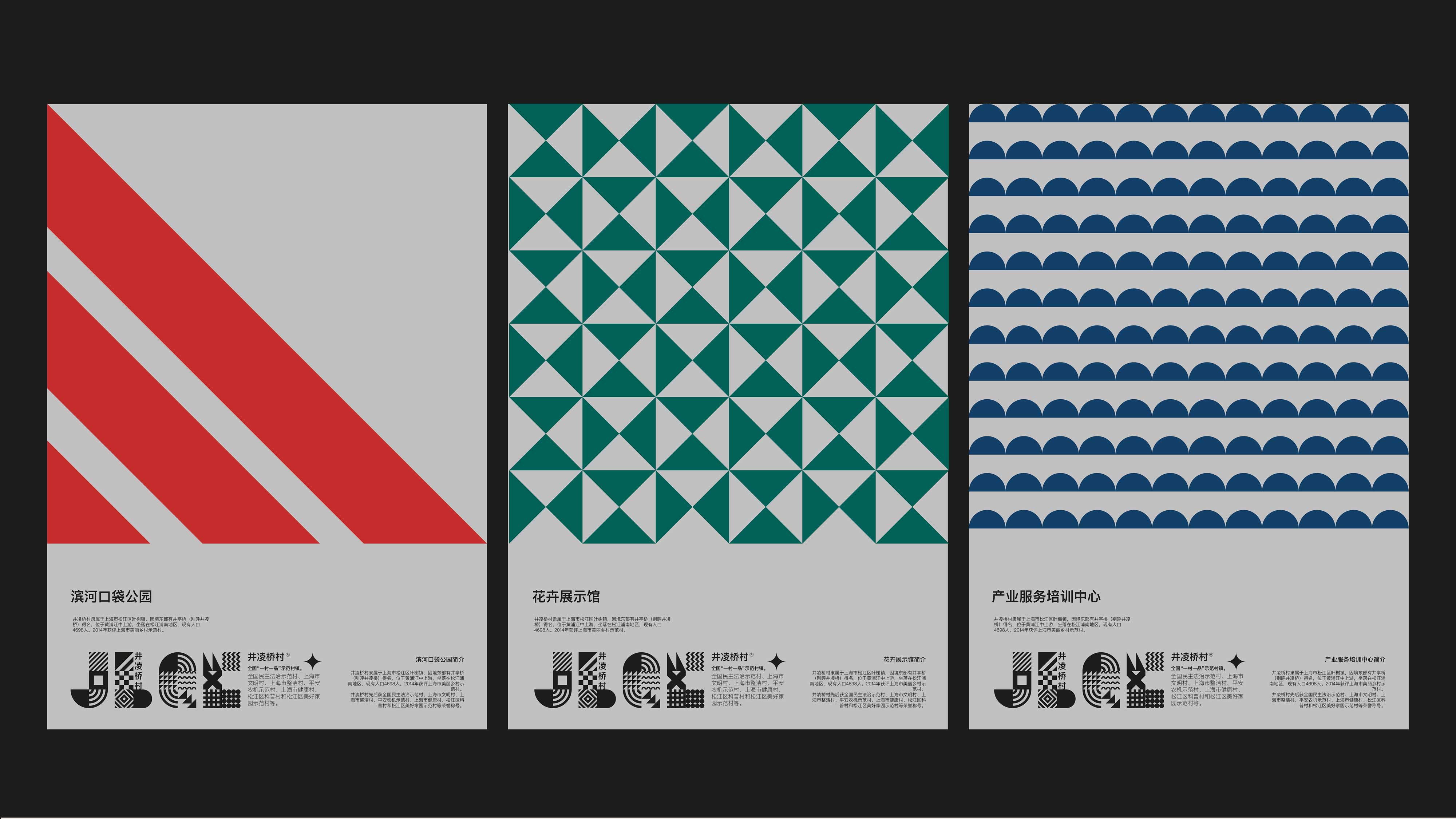
The architectural style of Jinglingqiao Village consists of two parts: one is the original buildings, and the other is the renovated and newly constructed buildings based on them, featuring a unique Jiangnan style while vigorously developing the flower industry structure. Flowers unite our people, instilling a sense of community, mutual support, and friendship.
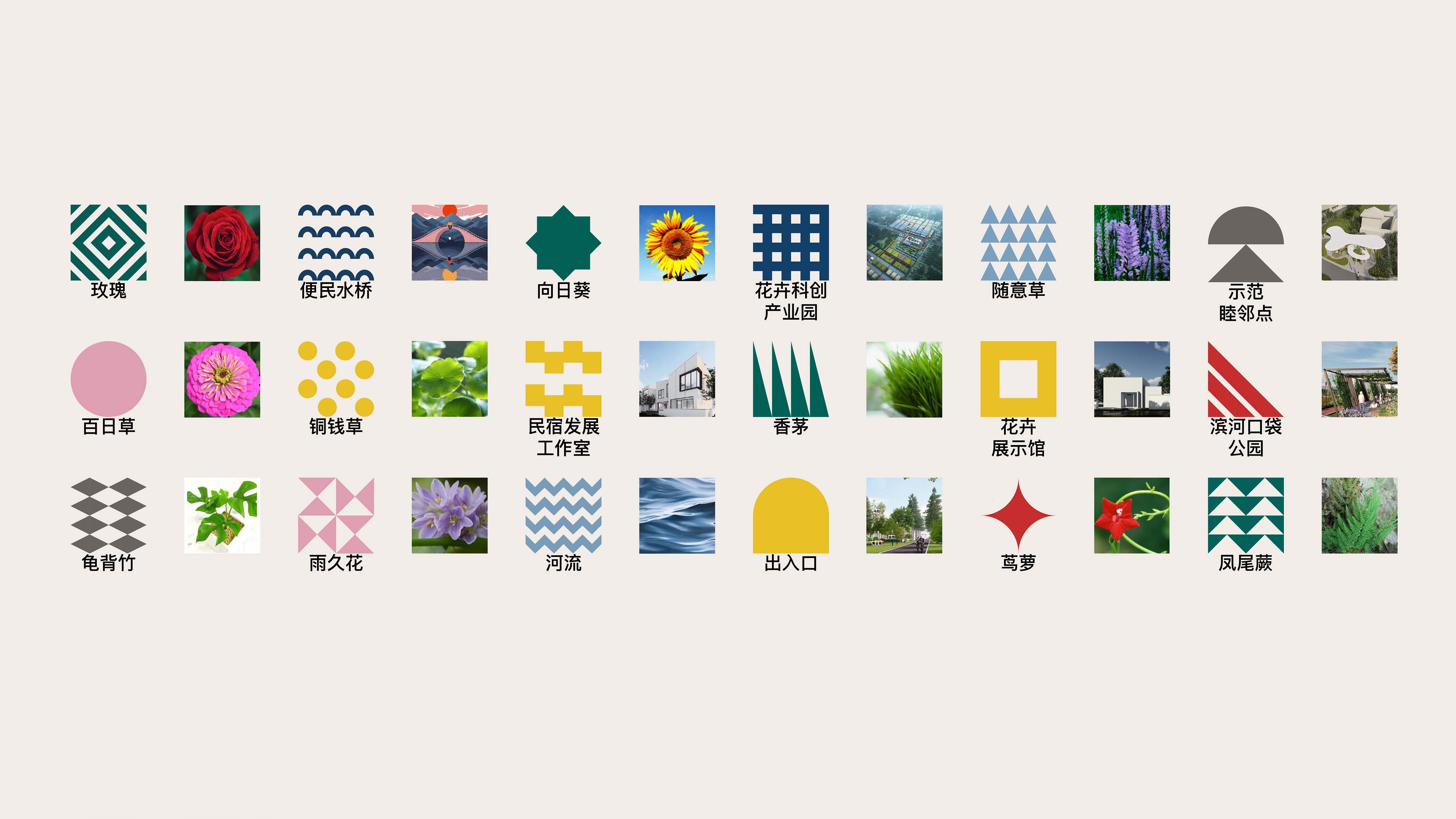
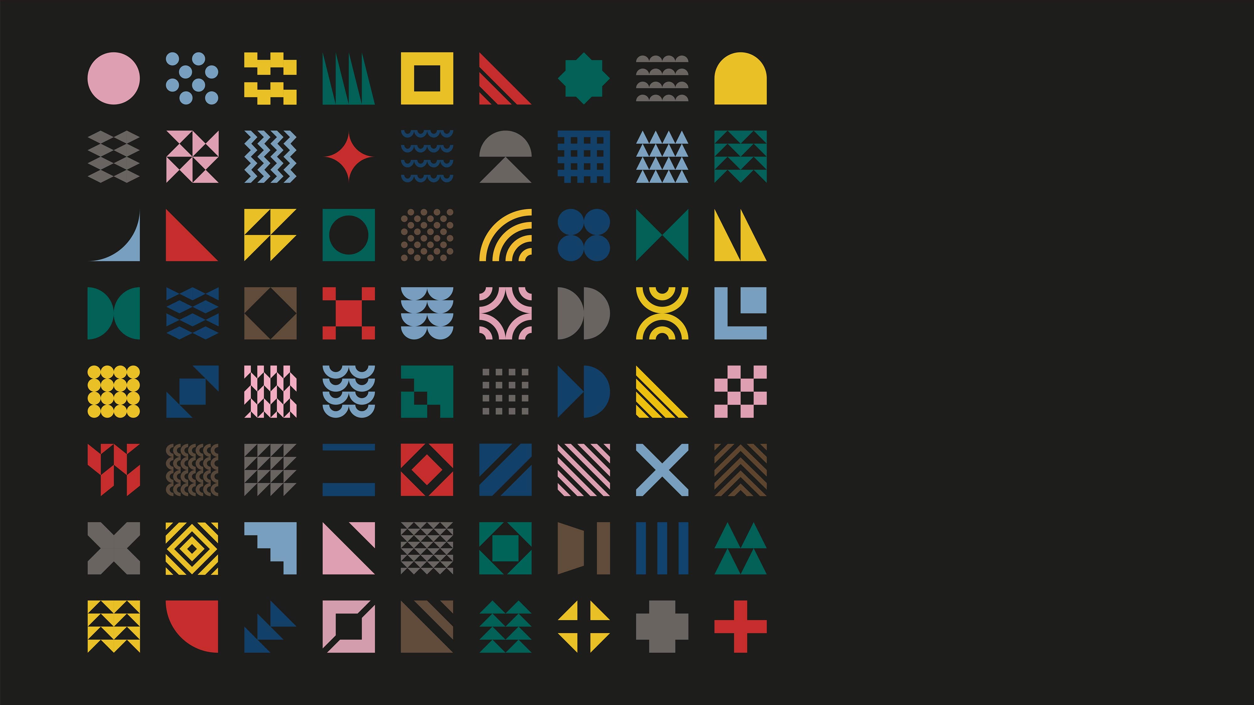
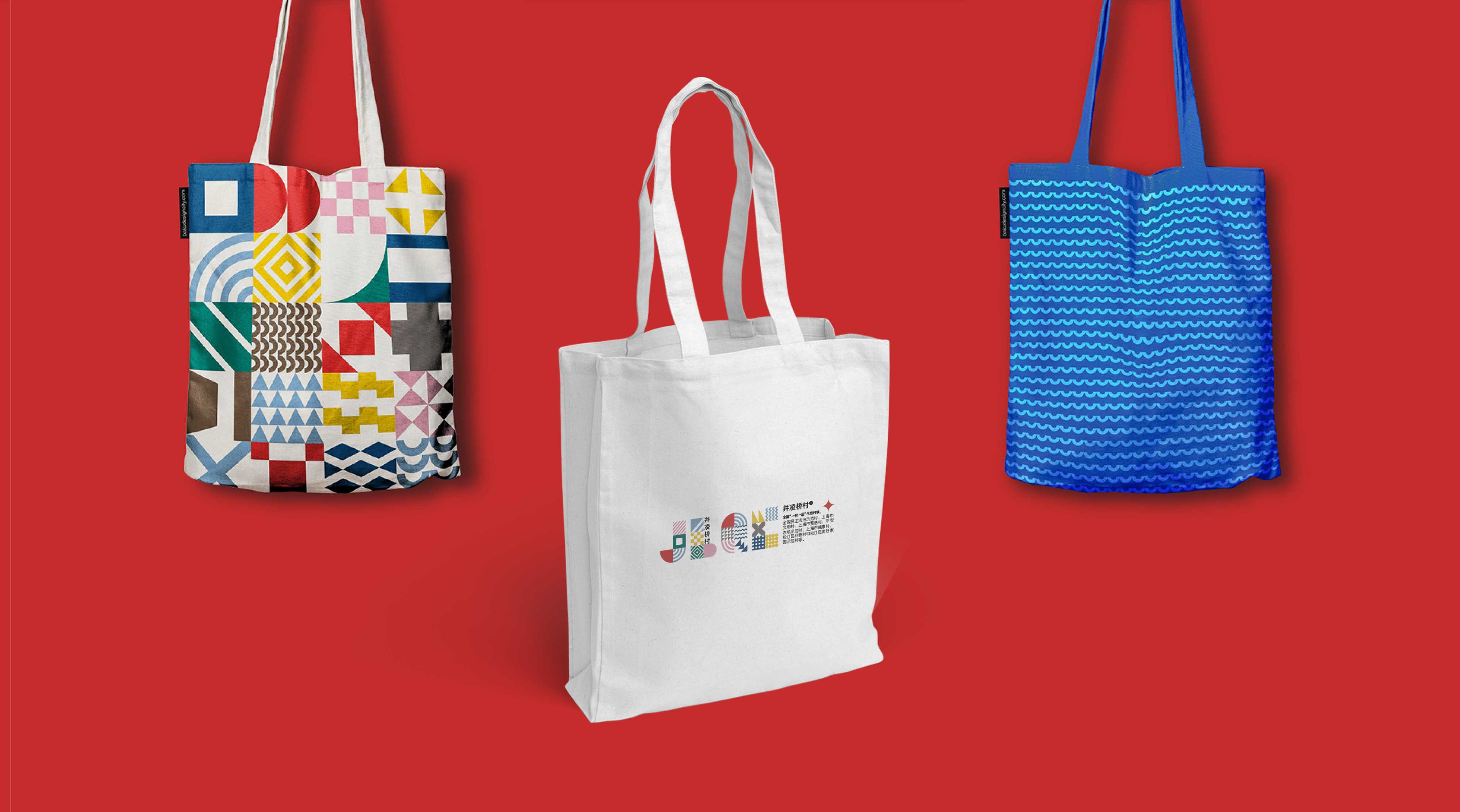
Inspired by the "flower industry" and important "symbols of communication" to aid in designing the navigation logo, we created a set of icons that can be reproduced in any form and easily adapted to any format.
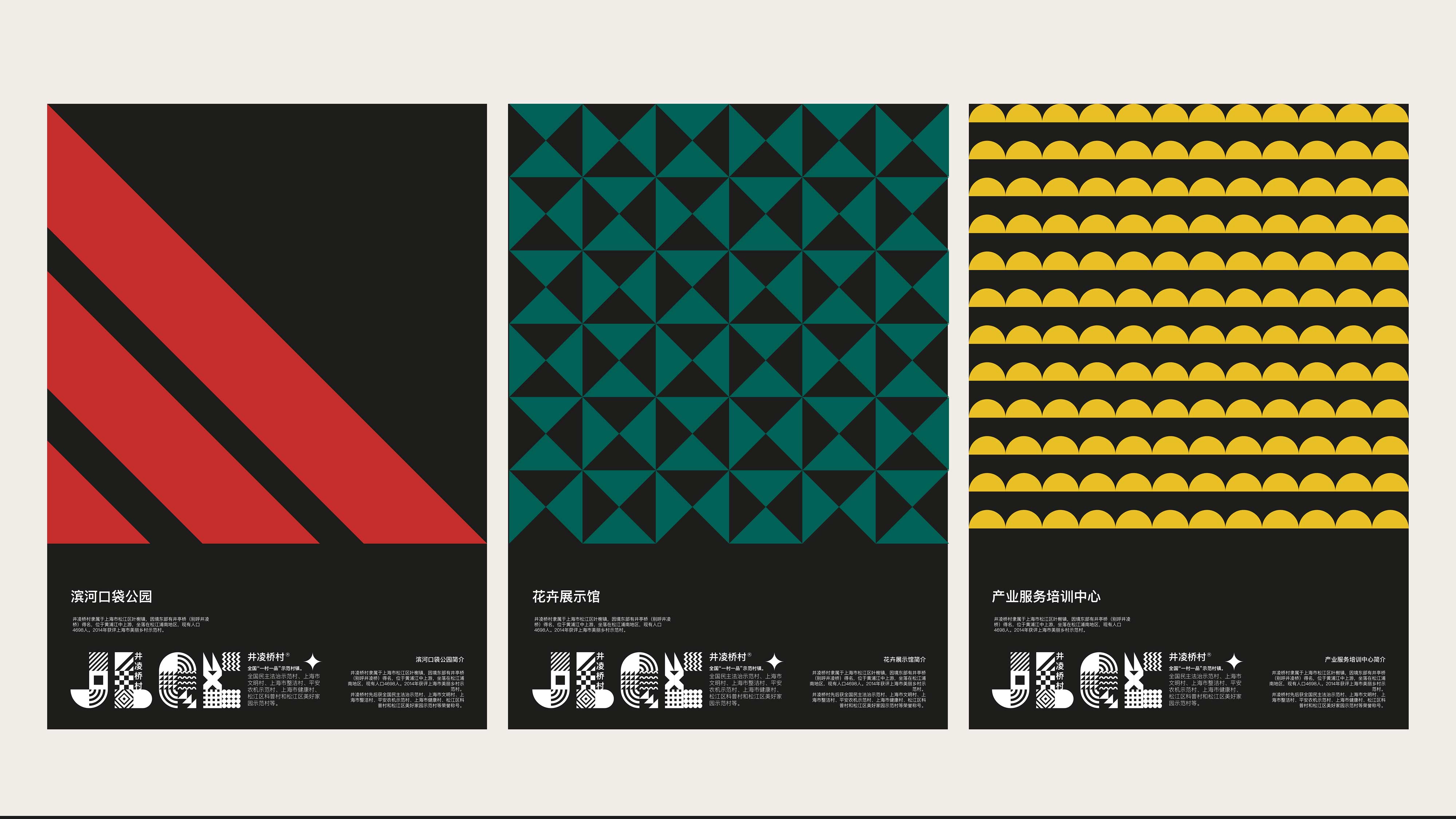
Each of these icons can be repeated individually to form a pattern, and they can be continuously redesigned. The pattern or set of icons is intended to enhance the identity of the style. Because flowers are an important industrial structure of this place, this logo was chosen as the most convenient way for the brand to communicate, be recognized, and be remembered.
The visual characteristics of this style are obtained through the visual association of asymmetrical organization within a mathematically constructed network, capable of providing accurate and authentic information types, free from objective photography and the influence of advertising and commercial advertisements. It rejects overly expressive and eccentric solutions, applying scientific methods to design. We apply the thinking of an artist to design, rather than expressing a channel of communication that only artists can understand; we must express our intended message very objectively and clearly.
Our design must also be modern and developmental. We believe it is our mission to have a dynamic design that aligns with future values.


Shanghai Jinglingqiao Village Wayfinding System
Type | Brand Promotion
The architectural style of Jinglingqiao Village consists of two parts: one is the original buildings, and the other is the renovated and newly constructed buildings based on them, featuring a unique Jiangnan style while vigorously developing the flower industry structure. Flowers unite our people, instilling a sense of community, mutual support, and friendship.
Inspired by the "flower industry" and important "symbols of communication" to aid in designing the navigation logo, we created a set of icons that can be reproduced in any form and easily adapted to any format.
Each of these icons can be repeated individually to form a pattern, and they can be continuously redesigned. The pattern or set of icons is intended to enhance the identity of the style. Because flowers are an important industrial structure of this place, this logo was chosen as the most convenient way for the brand to communicate, be recognized, and be remembered.
The visual characteristics of this style are obtained through the visual association of asymmetrical organization within a mathematically constructed network, capable of providing accurate and authentic information types, free from objective photography and the influence of advertising and commercial advertisements. It rejects overly expressive and eccentric solutions, applying scientific methods to design. We apply the thinking of an artist to design, rather than expressing a channel of communication that only artists can understand; we must express our intended message very objectively and clearly.
Our design must also be modern and developmental. We believe it is our mission to have a dynamic design that aligns with future values.
—— Reshaping Design RIDS